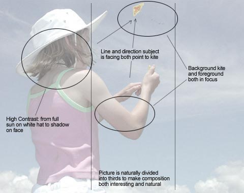
(Up to Nicole and Her Kite Page) Nicole and Her Kite: DiagramThis is how I analyze the structure of this picture. The depth of field which creates good focus in both the foregraound subject (Nicole) and background subject (kite) is the real key. The real background (sky) is in focus but because it is a neutral blue with little detail it doesn't clutter the photo. Notice the picture is naturally divided into three parts - a classic composition technique. |
![[Up]](../XuShared/Up4B.jpeg)
Comment on this page: Useful • OK • Useless or: View Results |
||||||||||||